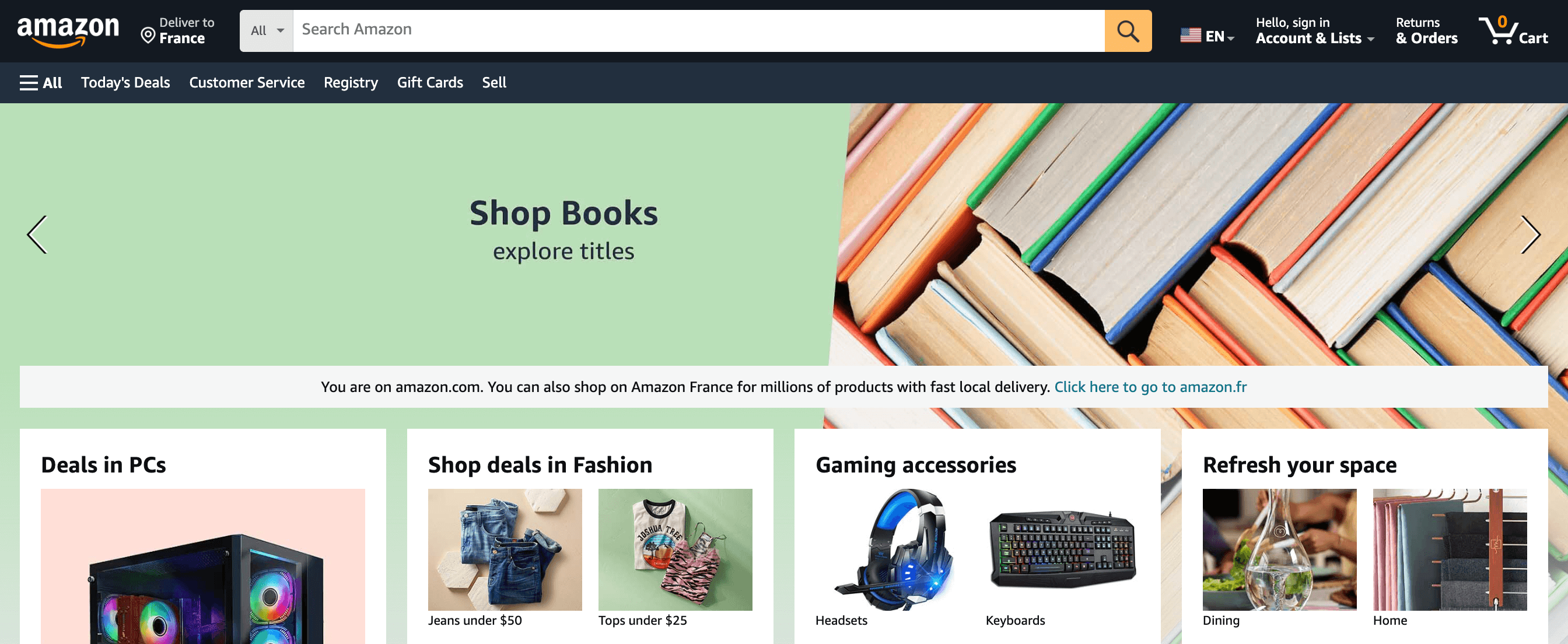
On every page of amazon.com, there's a large text input visible at the top, making it impossible to miss. Let's zoom on it a bit...
You've most likely searched for things on Amazon, but did you take the time to appreciate how well everything is designed to help you along the way? Well, now is the time to slow down and analyze step-by-step the search experience of Amazon.
On every page of amazon.com, there's a large text input visible at the top, making it impossible to miss. Let's zoom on it a bit...

There's a "Search Amazon" placeholder and a magnifying glass icon. There's no doubt left: this is a search input.

As soon as I click on it, a menu appears with the most recent queries I made. This information can easly be ignored, but it's handy if I'm looking for something I've already searched for.

Now is the time to search for something, like a book for my heroic fantasy collection. Once I type just one character, the previous information is replaced with query suggestions that start with the letter I entered.

With every additional keystroke, the suggestions are updated instantaneously and become more and more relevant. This has two main benefits:

Also, did you notice that all words are bolded in the suggestions, except the one I typed? This is a great way to put emphasis on what's important and make everything more scannable. Many websites do the opposite (only bolding the word that was typed), which is a mistake.

And without surprises, the suggestions are relevant even if I made a typo.

Once I press enter, click on the 🔍 icon, or select a suggestion in the list, I'm redirected to a new page containing the search results. There's a lot going on here, so let's focus on each part from top to bottom.
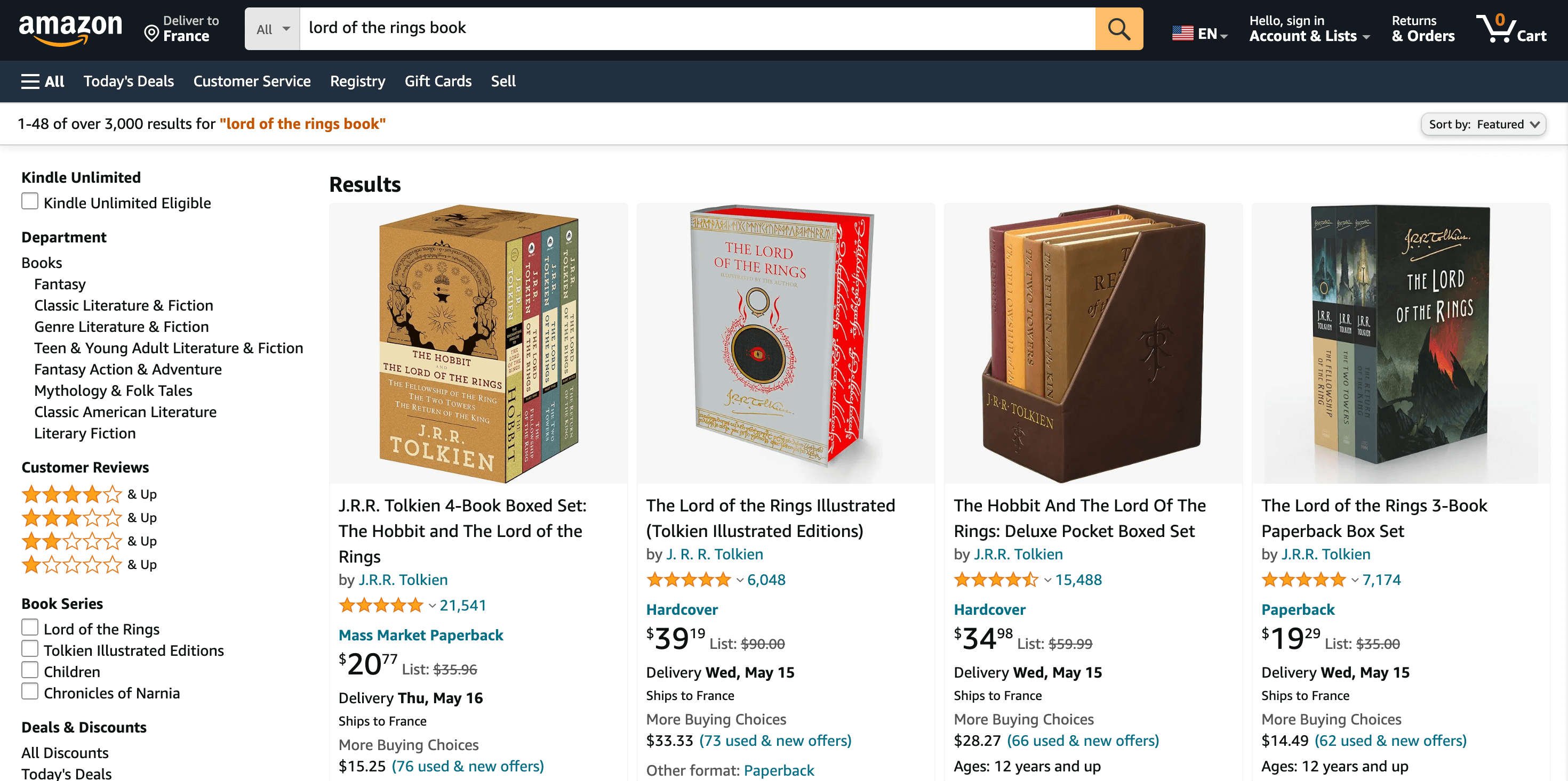
First, the familiar search bar is here with my query pre-filled. This gives me a reminder of why I'm here and allows me to easily make changes if needed.
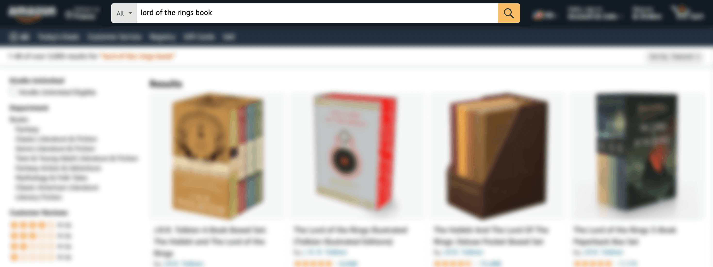
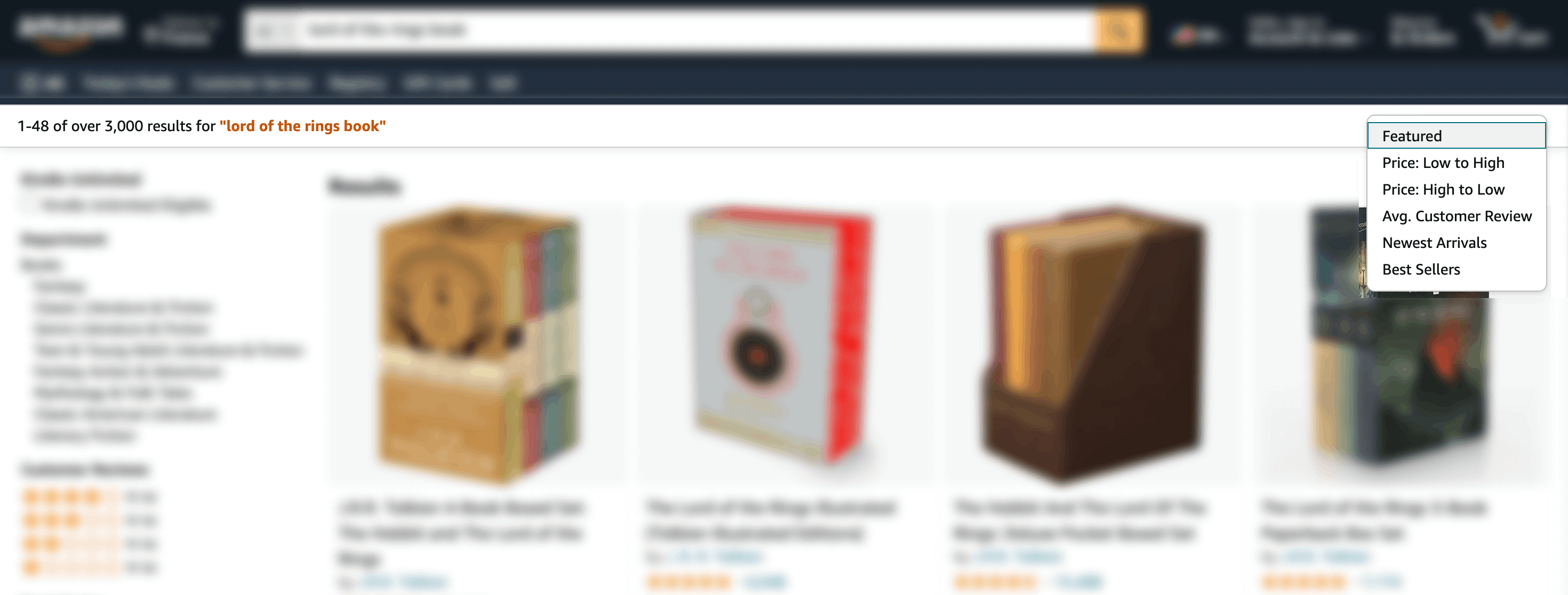
Just below there's a small section with:
In the sidebar, there are a dozen filters (also called facets). This is a must to narrow down the search results, especially when there are thousands of products to choose from. Note that Amazon has two main types of filters. First, the static ones that are always displayed, such as "department" and "customer reviews".
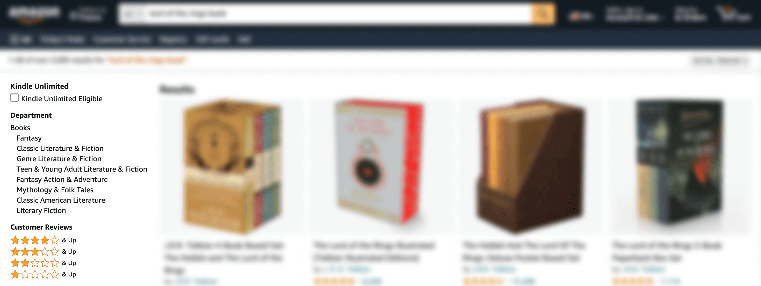
And second, the dynamic ones that depend on the search query typed, such as "book format" and "book language". If I searched for a TV, different filters would appear.

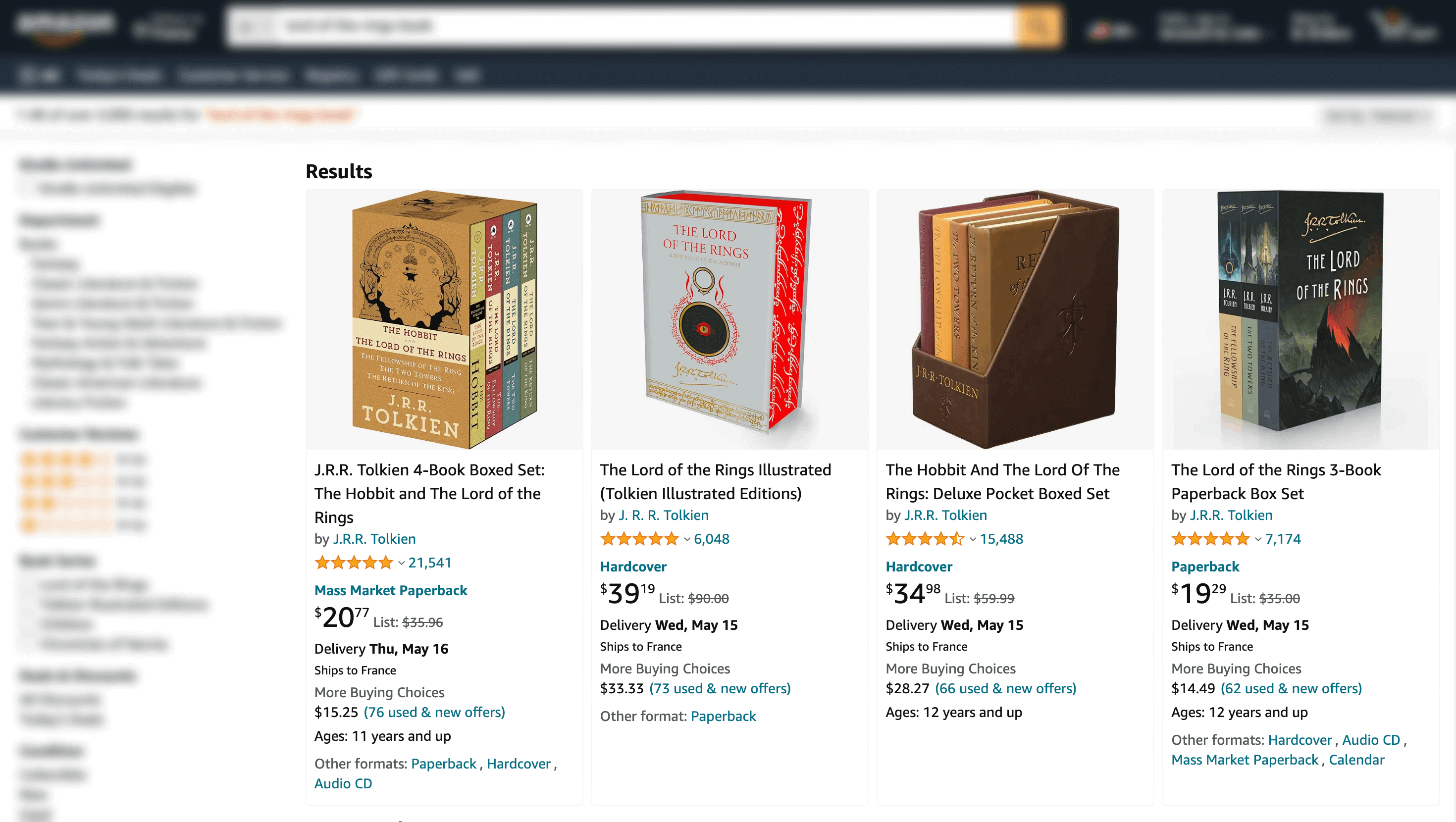
Now I get to the main part of the page: the search results. Each product contains valuable information to help me decide if I should click on it or not: image, title, rating, price, and delivery estimate. And as you can see, the results are very relevant!
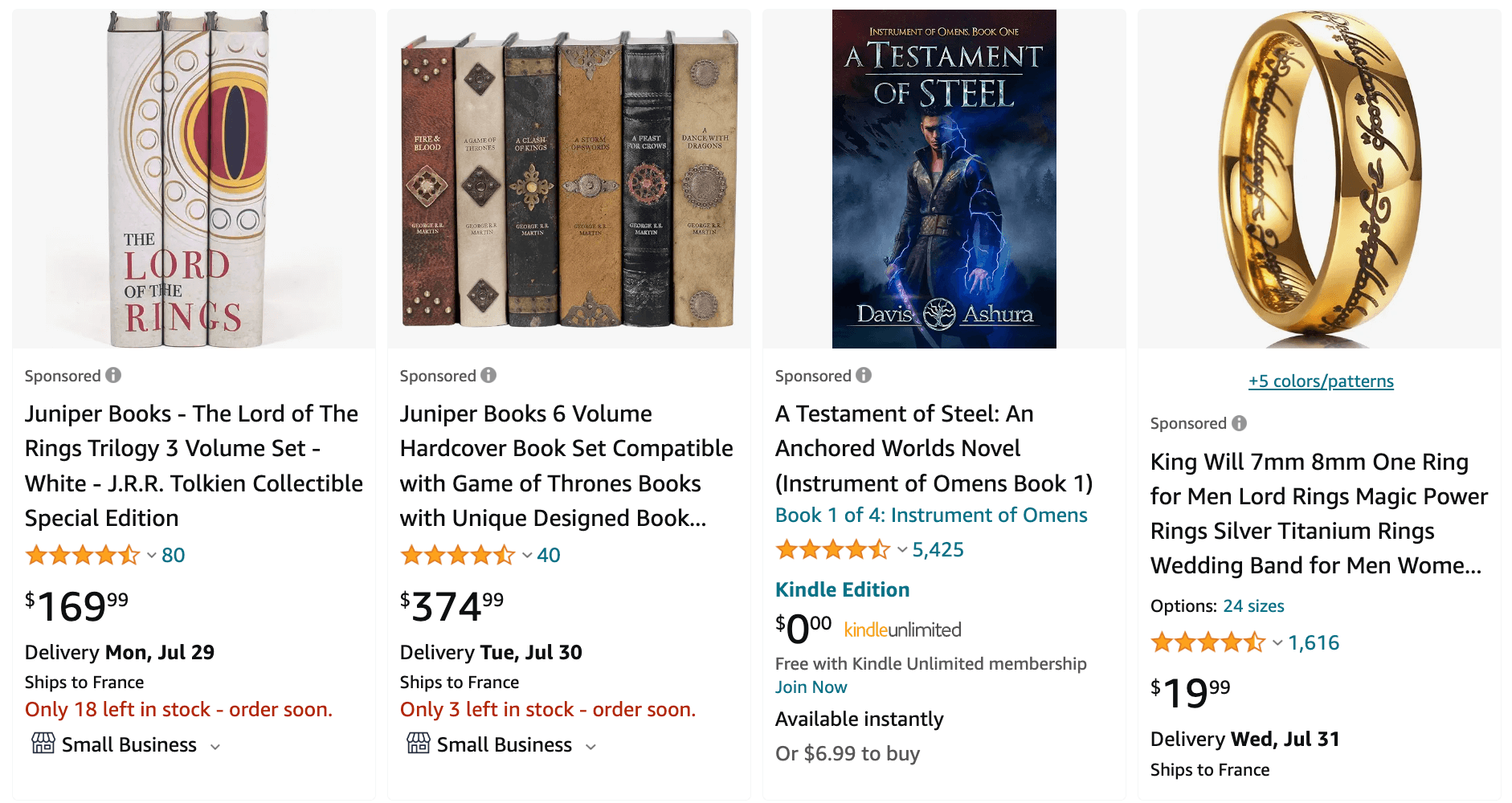
But when I disable my ad blocker, a lot of "sponsored" articles appeared within the results. I counted 18 ads on the first page only, and they tend to be less relevent that the regular results.
Below the last row of results there is a "related search" section. It doesn't take much space, but it can be useful. For example if I didn't find what I was looking for because my query wasn't quite right, I can fix that in a single click.

And finally, a pagination to go through more results. After running some tests, I realized that no matter the search query, there's no way to go past page 20. I'm guessing that no one needs that many pages, and if they did they wouldn't find many relevant results there.

With just four keystrokes and a few clicks, I ended up finding exactly what I was looking for. The book is now sitting in my cart, and will soon be in my bookshelf.
There are hundreds of Amazon employees working on the search experience, and it shows. The experience is best-in-class: easy to use, powerful, fast, and relevant.
If you liked this, make sure to check my other articles about Search Experience.