Here's the "r/all" subreddit, that shows the most popular content across all of Reddit. Can you spot the search bar?

Let's see how one of the most visited website handles their search experience.
Here's the "r/all" subreddit, that shows the most popular content across all of Reddit. Can you spot the search bar?
It's in the right sidebar, and it has many issues:

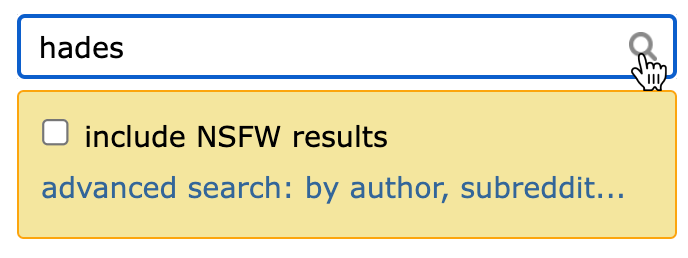
When I click on the input, a yellow box appears just below with two options: "include NSFW results" and "advance search". Seing a UI element appear out of nowhere and with a bright color is quite distracting, especially when these options could have been shown later on the results page.
Typing a search query requires some effort: thinking about what we are looking for, finding the right keywords, and actually typing them correctly. So Reddit should help users here, instead of distracting them.

The video game Hades II was recently released, so let's type "hades" in the input. But wait, where's the "search" button?

After some time I realized that the small magnifying glass icon is the button, but that's really easy to miss! I guess they expect users to press "enter" to submit the form, and that's what I did.
Now I'm on the search result page. There's a lot going on here, so let's look at every section one by one, from top to bottom.
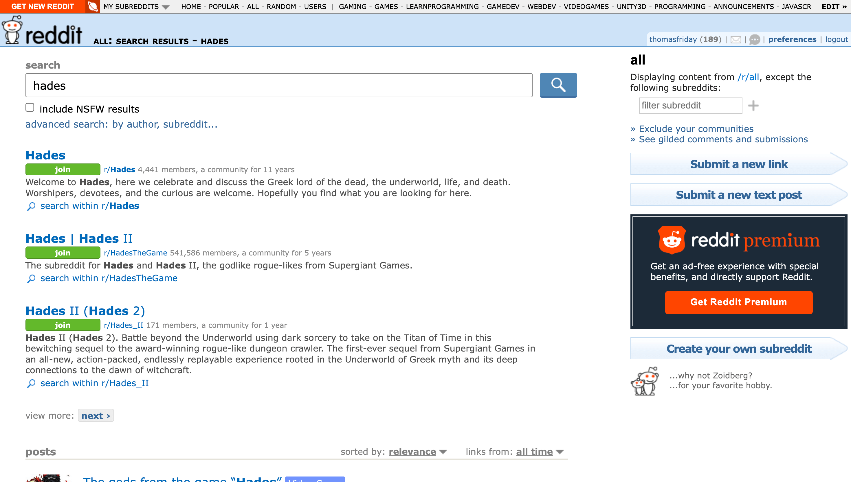
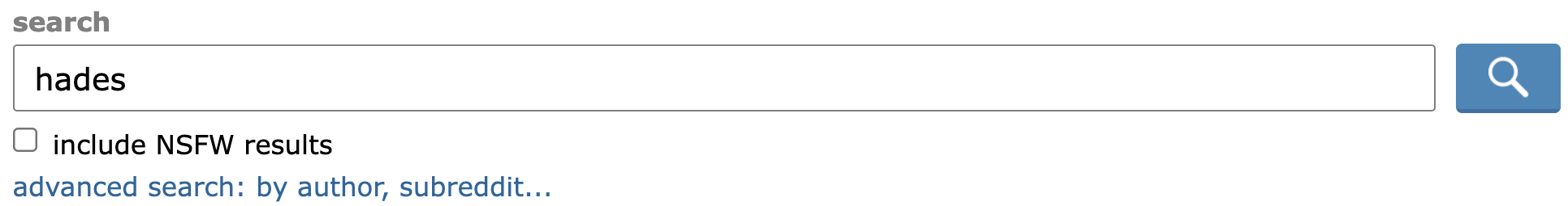
At the top we get the search bar with our query. It makes sense, but that's a bit disorienting since it's not where it was previously. Note that this search input is much better than before: it's in a more logical position, it's wider, and this time there is a "🔎" button that looks clickable. They also removed the bright yellow box.
Then we get some results, but it's not immediately clear what these are. It's actually a list of subreddits that match my search query. A label indicating this would have been nice.
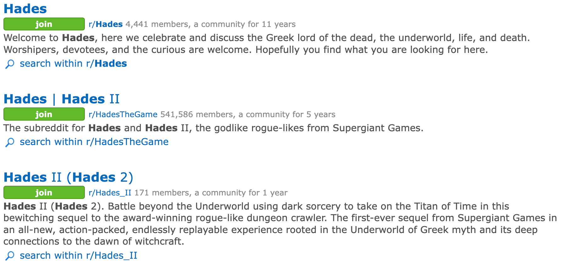
Next we get more search results, and this time we know what they are since there is a "posts" label. There's a lot of positive things to say here:
On the negative side, a lot of emphasis is put on the post flairs ("video game", "Hades II", etc.) which don't seem valuable here.
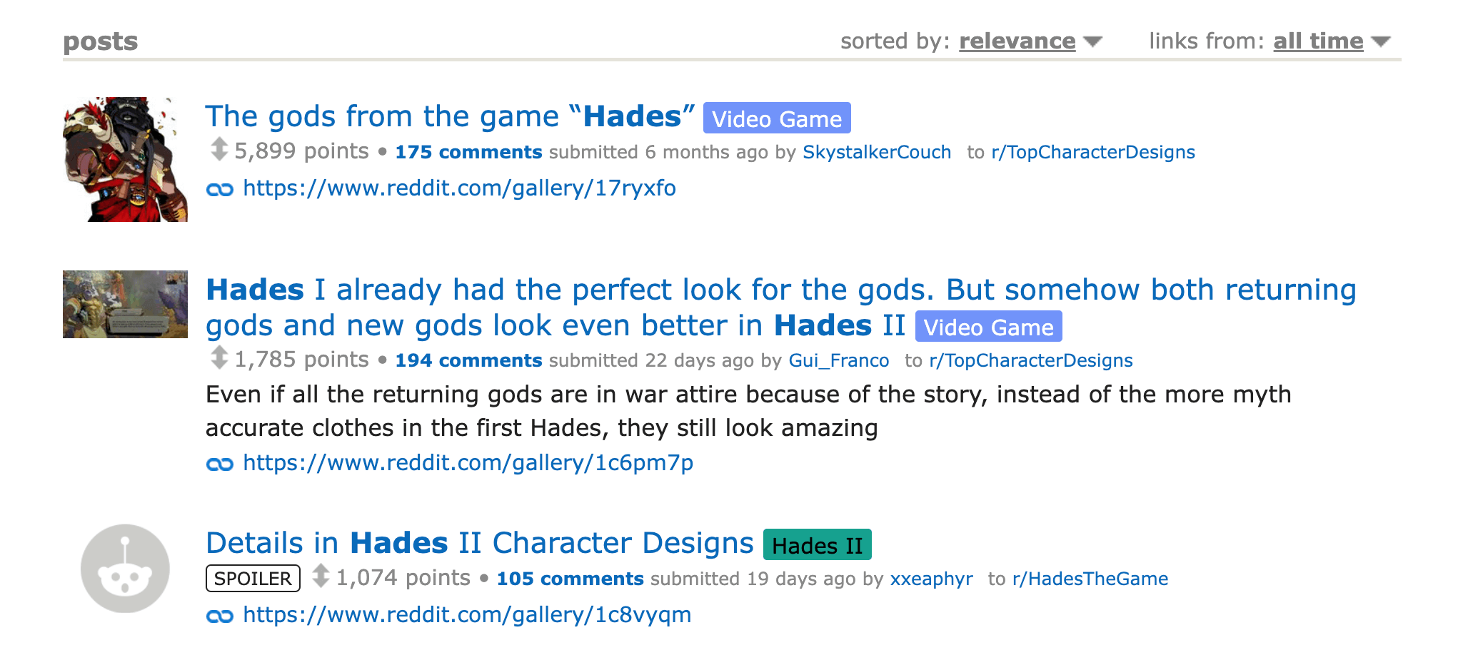
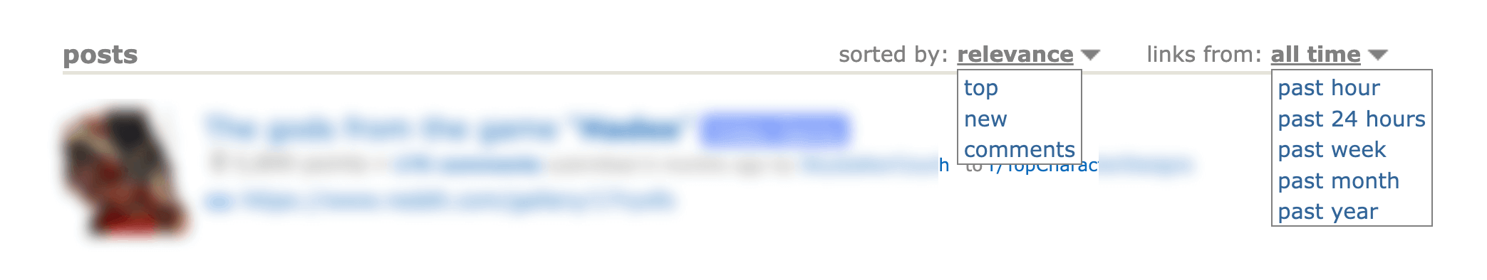
There's also two dropdowns:
Both are useful, but the sorting names are confusing and could be clarified.
Below the last result, there's the pagination. Except there's not really a concept of page here, it's just two buttons: "prev" and "next". So it's easy to get lost after a few clicks.